# 基于Vue的Dialog对话框组件的实现
今天来实现一个基础的对话框组件~
# 演示
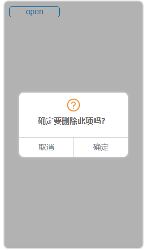
- 点击open按钮打开对话框
- 点击取消在控制台打印出“已取消”,并关闭对话框
- 点击确定在控制台打印出“已确定”,并关闭对话框
# API
- mask:控制是否展示遮罩
- info:对话框显示内容
- icon:对话框提示图标,有success,error,info,question可选
- cancelText:设置取消按钮文字
- okText:设置确认按钮文字
# 事件
- cancel:取消按钮的回调
- ok:点击确定回调
# 基础组件dialog.vue
说明:在dialog组件最外层div上设置@click.stop是为了防止事件冒泡触发上层点击事件。 用require引入图片,否则在编译后是找不到图片的。
<template>
  <div class="shadow-wrapper" v-if="visible" @click.stop ref="mask"><!-- 遮罩层 -->
    <div class="dialog-wrapper">                                    <!-- 对话框 -->
      <div class="info-wrapper">                                    <!-- 对话框内容部分 -->
        <img class="icon" :src="require(`../common/images/${icon}-circle.png`)">
        <div class="text">{{info}}</div>
      </div>
      <div class="btn-wrapper">                                     <!-- 对话框按钮部分 -->
        <div class="btn" @click="onCancel">{{cancelText}}</div>
        <div class="btn" @click="onOk">{{okText}}</div>
      </div>
    </div>
  </div>
</template>

<script type='text/ecmascript-6'>
export default {
  props: {
    mask: { /* 控制遮罩 */
      type: Boolean,
      default: false
    },
    icon: { /* 图标类型 */
      type: String,
      default: 'info'
    },
    info: { /* 文字内容 */
      type: String,
      default: '内容'
    },
    cancelText: { /* 取消按钮文字 */
      type: String,
      default: ''
    },
    okText: { /* 确认按钮文字 */
      type: String,
      default: ''
    }
  },
  data () {
    return {
      visible: true /* 控制对话框显示 */
    }
  },
  mounted () {
    setTimeout(() => { /* 确保能获取到mask修改其背景属性 */
      if (this.mask) {
        this.$refs.mask.style.background = 'rgba(0,0,0,.3)'
      }
    }, 20)
  },
  methods: {
    show () { /* 打开对话框 */
      this.visible = true
    },
    hidden () { /* 关闭对话框 */
      this.visible = false
    },
    onCancel () { /* 点击取消 */
      this.$emit('cancel')
      this.hidden()
    },
    onOk () { /* 点击确认 */
      this.$emit('ok')
      this.hidden()
    }
  }
}
</script>

<style lang="stylus">
.shadow-wrapper                   /* 覆盖整个页面 */
  position absolute
  top 0
  left 0
  height 100%
  width 100%
  .dialog-wrapper                  /* 垂直居中 */
    position relative
    top 50%
    left 50%
    transform translate(-50%, -50%)
    width 220px
    background #ffffff
    border solid 1px #ccc
    border-radius 10px
    box-shadow 0 0 5px #ccc
    color #777777
    .info-wrapper
      min-height 80px              /* dialog随内容撑开高度 */
      text-align center
      font-weight bold
      margin-bottom 50px
      .icon
        margin-top 10px
        height 30px
        width 30px
      .text
        line-height 30px
        color #666
    .btn-wrapper
      position absolute
      display flex
      height 40px
      width 100%
      bottom 0
      .btn
        flex 1
        text-align center
        line-height 40px
        border-top 1px solid #ccc
        &:first-of-type
          border-right 1px solid #ccc
</style>
# 应用组件dialog-apply.vue
<template>
  <div class="dia-apply" @click="isclick">
    <div class="operation">
      <div class="btn" @click="open">open</div>
    </div>
    <Dialog ref="dialog"
            :info="info"
            :icon="icon"
            :mask="mask"
            :cancelText="cancelText"
            :okText="okText"
            @cancel="onCancel"
            @ok="onOk"
    ></Dialog>
  </div>
</template>

<script type='text/ecmascript-6'>
import Dialog from 'base/dialog'
export default {
  data () {
    return {
      info: '确定要删除此项吗?',
      icon: 'question',
      cancelText: '取消',
      okText: '确定',
      mask: true
    }
  },
  methods: {
    open () {
      this.$refs.dialog.show()
    },
    close () {
      this.$refs.dialog.hidden()
    },
    onCancel () {
      console.log('已取消')
    },
    onOk () {
      console.log('已确定')
    },
    isclick () { /* 测试是否冒泡 */
      console.log('事件冒泡啦')
    }
  },
  components: {
    Dialog
  }
}
</script>

<style lang="stylus">
@import '../common/stylus/base.styl'
.dia-apply
  position relative
  margin 0 auto
  height 500px
  width 280px
  overflow hidden
  border 2px solid #ddd
  border-radius 10px
  .operation
    position absolute
    top 0
    left 0
    .btn
      height 20px
      width 100px
      text-align center
      line-height 20px
      margin 10px
      color $color-highlight
      border 1px solid $color-highlight
      border-radius 5px
</style>